Project Brief
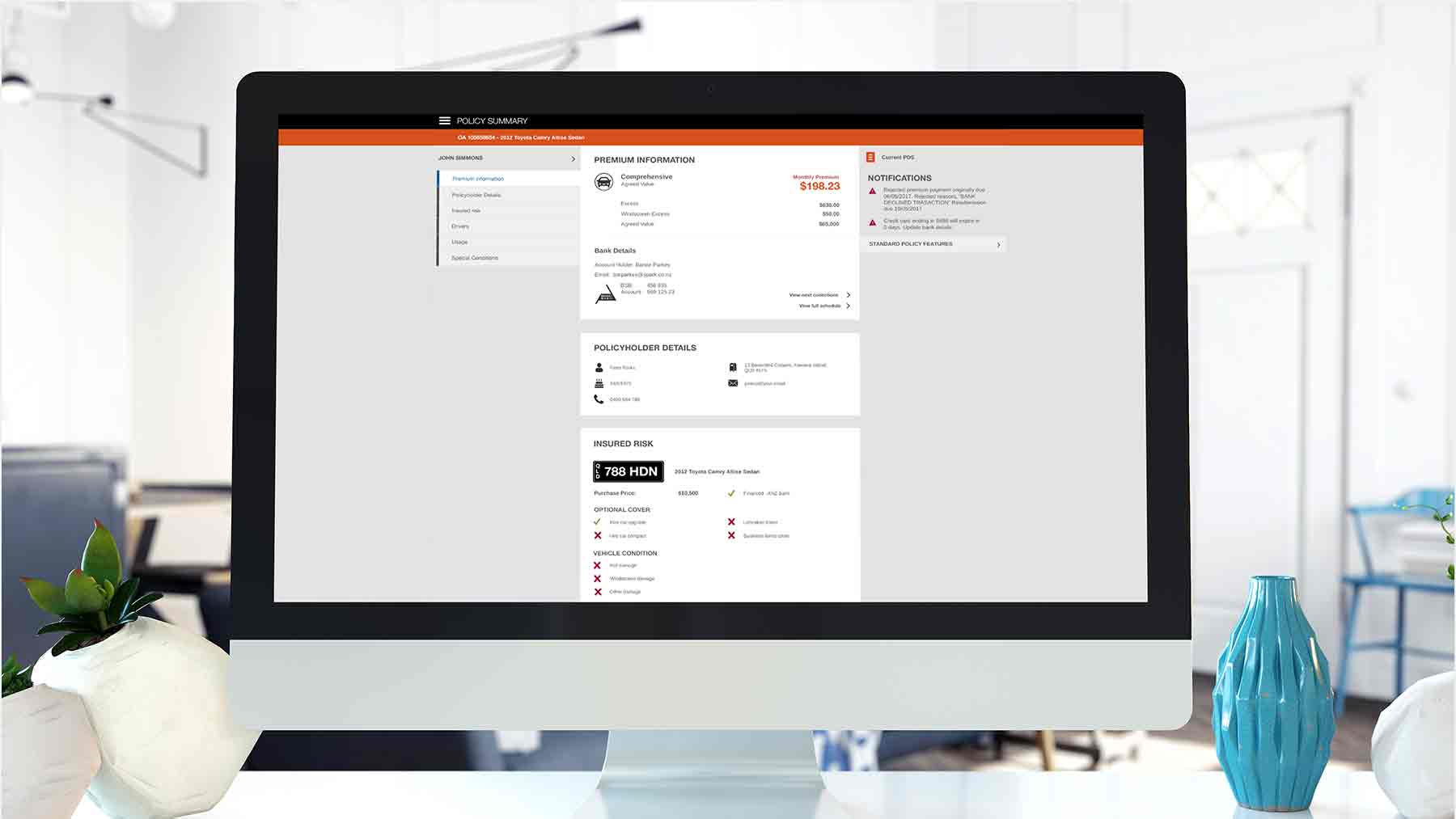
Youi’s Advisor system had been built initially by in house by technology teams to support front line customer service staff with policy renewals, updates and cancellations.
As the company grew, the Advisor system became a pain point for staff to service the needs of customers, resulting in increased policy cancellations. From a technical perspective, there was also significant technical debt to be addressed to enable efficient in house technical support.
The brief was to investigate the usability issues of the current Advisor system and re design the system to increase the productivity of Youi staff.
Project Summary
ROLE | Lead UX Designer
PROJECT | Complex system usability evaluation and redesign.
DURATION | 12 months
RESPONSIBILITIES | Discovery, requirements gathering, user research, wireframing, screen flows, system performance metrics, usability testing.
STAKEHOLDERS | IT Development Team, Callcentre Managers
TARGET USERS | Frontline Callcentre Customer Service Agents.
TOOLKIT | Axure RP, Silverback, JIRA, Confluence, Photoshop, Illustrator, OmniGraffle, OmniProject
Discovery
Contextual inquiry within the call centre was performed to obtain a greater understanding of the needs of call centre staff when using the current system to make policy changes for customers.
Key insights from the contextual inquiry included:
- Staff had to open multiple windows of Advisor to service a customer.
- Navigating through the Advisor system increased call times
- High levels of frustration for new staff members using the Advisor system from lack of understanding specific terms in the interface.
Staff surveys were used to gather staff demographics and clarify or reinforce findings from contextual inquiry activities.
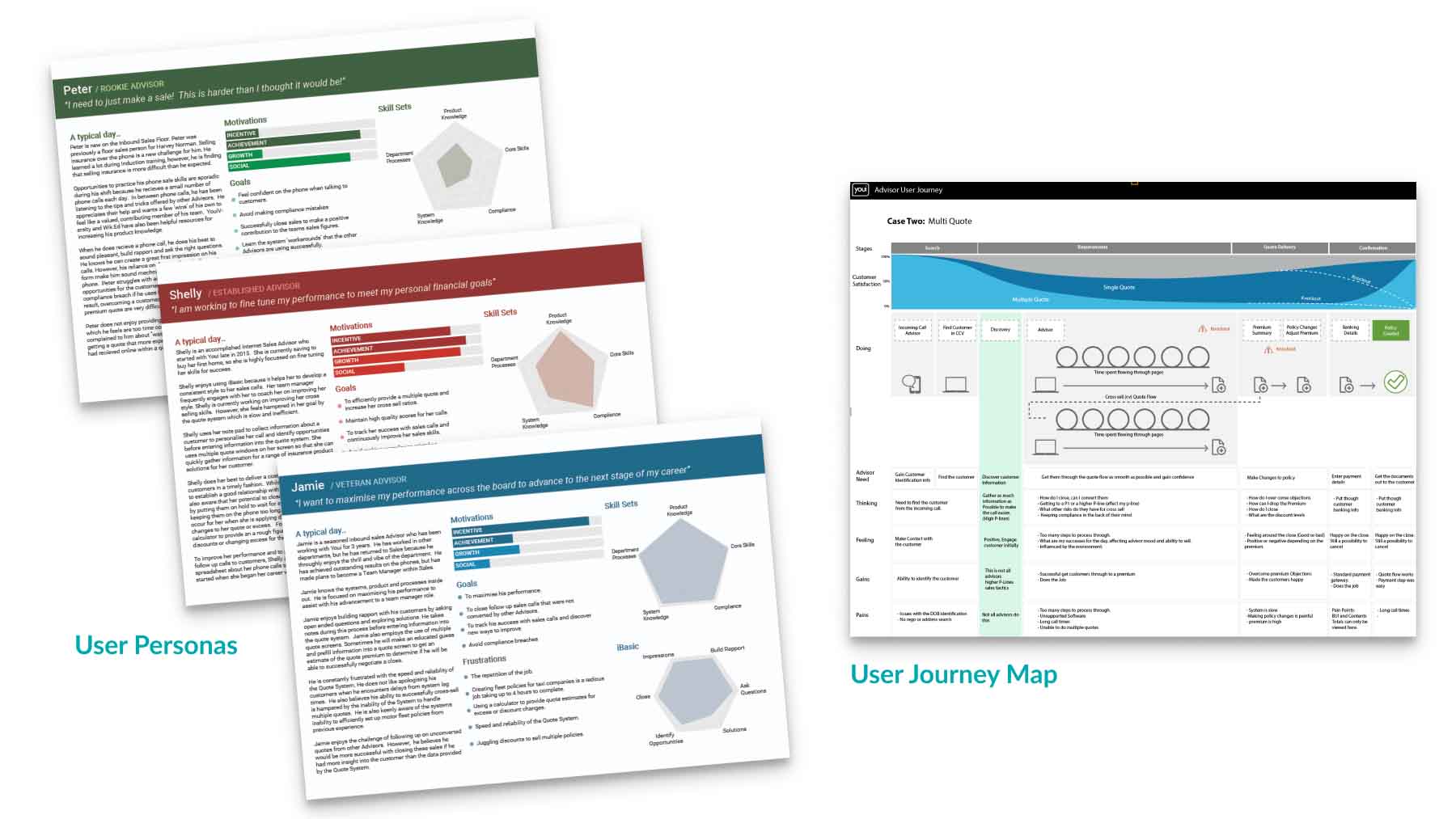
All the data gathered about staff end users culminated in the production of 3 staff user persona’s based on skill level and product knowledge to inform design and development decisions.
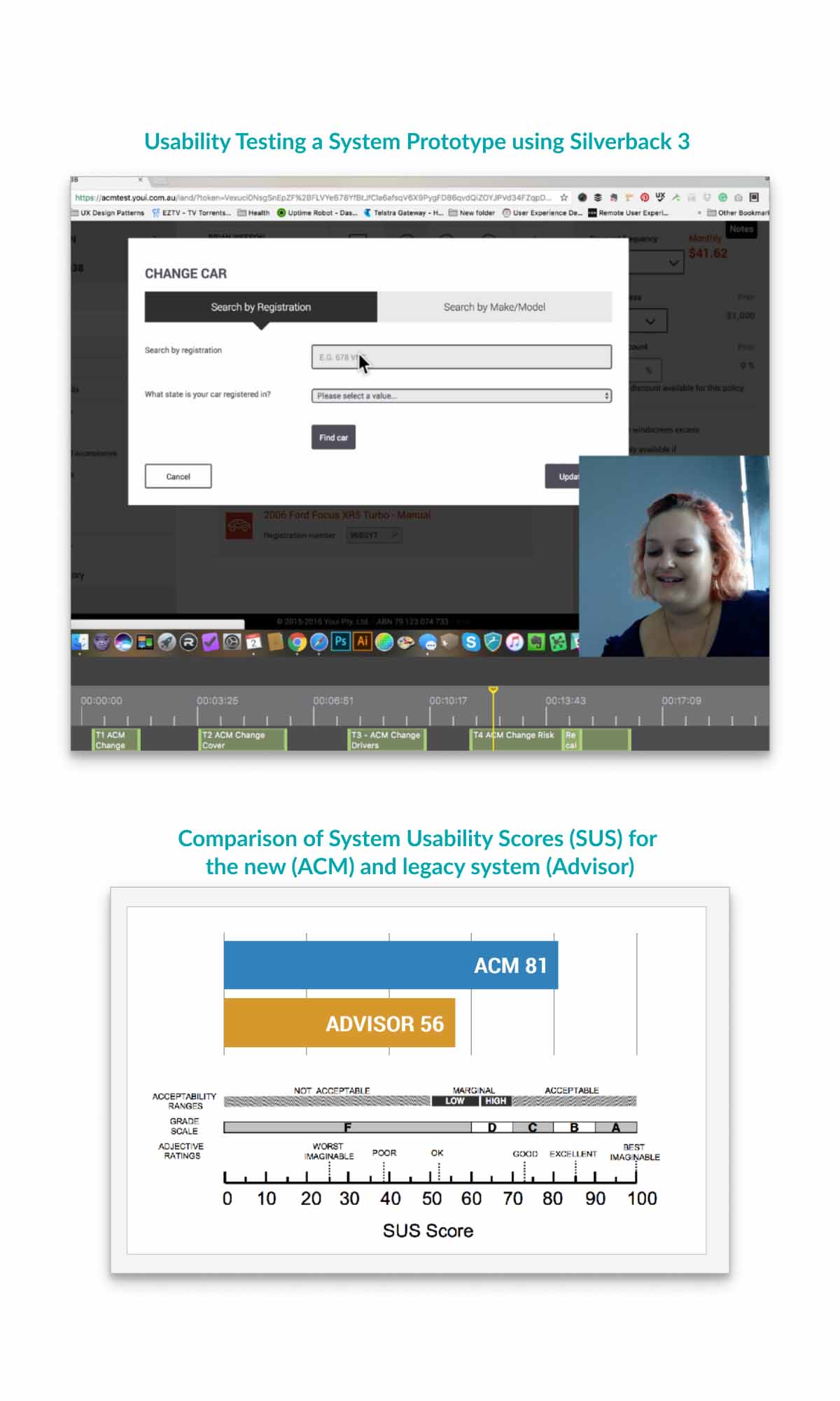
A System Usability Survey was also provided to staff to assess how staff viewed their use of the system on a daily basis. The Advisor system scored 56 or F Grading, reinforcing the need to address usability issues in the system that prevented staff from servicing Youi customers effectively.
Customer Journey Maps of key tasks were produced to provide valuable insights into the staff – customer interaction to ensure that the new system improved the overall customer experience for both staff and customers.
Design
Efficient navigation through the existing Advisor system was a considerable pain point for staff. This was due to the navigation structure growing organically over the years. To design an effective navigation that aligned with user needs, card sorting activities were conducted with Callcentre staff and Callcentre Managers. Staff user personas were used to select card sorting participants.
Card sorting analysis highlighted a distinct difference in understanding of terminology used between new experienced staff members. This difference was normalised through frequent feedback with callcentre staff on the conceptual information architecture designs for the navigation.
Youi’s customer facing website incorporates bold, eye-catching colours. However, these bold colours are not suitable for staff that need to use the system constantly for 7-8 hours a day. For the interface design of internal staff facing systems, a softer, subtle colour palette was implemented to reduce the risks of eye strain from frequent use by staff.
Elements of Youi’s bold colour product branding were included in the design as accents for staff product recognition. This also assisted staff to quickly and accurately flip between policy details screens when speaking with customers.
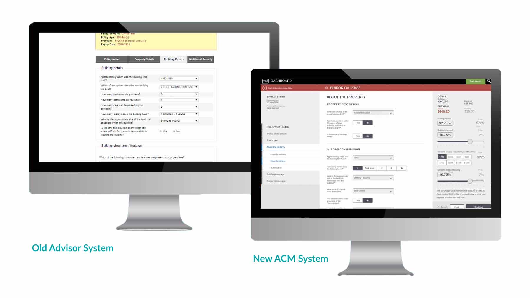
The Advisor UI was not responsive, this was a significant pain point that slowed calls and also increased data entry errors. The new system interface was responsive with 3 appropriate snap points derived from Google Analytics data for varying screen view points used by staff.
The previous Advisor system had a linear flow whereby consultants had to step through the full flow each time a change was made to the Policy during amendments. This was not conducive to servicing customers who were seeking to review their premium options. For this reason a side panel was incorporated into the new system that updated the premium in alignment with changes to the Policy.
Usability testing was conducted during sprints as required and prior to system release to validate and compare the new system with the old system. System Usability Scores (SUS) were also captured. Prototype testing of the new system with a follow up System Usability Survey proved that the new design was far more efficient and usable scoring 81 – Grade B.
User research and evaluation activities were referenced when defining user experience performance metrics using the Google HEART framework.
Key Deliverables
- UX Canvas
- Contextual Inquiry
- User Surveys
- User Personas
- User Journeys
- Usability Testing
- Card Sorting
- Wireframing
- Prototyping
- Screen Flows
- UI Design
Outcome
- 12% reduction in policy cancellations upon the first release of the new ACM system
- 40-60% increase in effectiveness and efficiency for staff across multiple system tasks
- 30% decrease in onboarding training for new staff because the new system was far more intuitive and easy to use.
- Legacy System (Advisor) SUS Score = F Grade, New system (ACM) SUS Score = B Grade

