Project Brief
In 2018, Credit Union Australia did not have the ability for a person to open a new bank account via their website.
Potential new members had two options to open a bank account:
- Complete an online form and wait for a CUA staff member to contact them.
- Attend a CUA branch and undergo a 40-60 minute paper based application process.
The brief was to significantly improve the customer experience both in branch and online within 2x 90-day Agile cycles.
Project Summary
ROLE | Lead UX Designer
PROJECT | Complex application form connected to security APIs + supporting website pages leading into the application form.
DURATION | 6 months
RESPONSIBILITIES | Discovery, user research, wireframing, screen flows, UI design
STAKEHOLDERS | Marketing, Digital Team, Banking Product Teams, Banking Branch Teams
TARGET USERS | Customers seeking to open a bank account with CUA, CUA Branch Staff.
TOOLKIT | Sketch, Invision, Sharepoint, Squiz CMS, Photoshop, Illustrator.
Discovery
To clearly understand the customer journey and current pain points, the key activities during the discovery phase included:
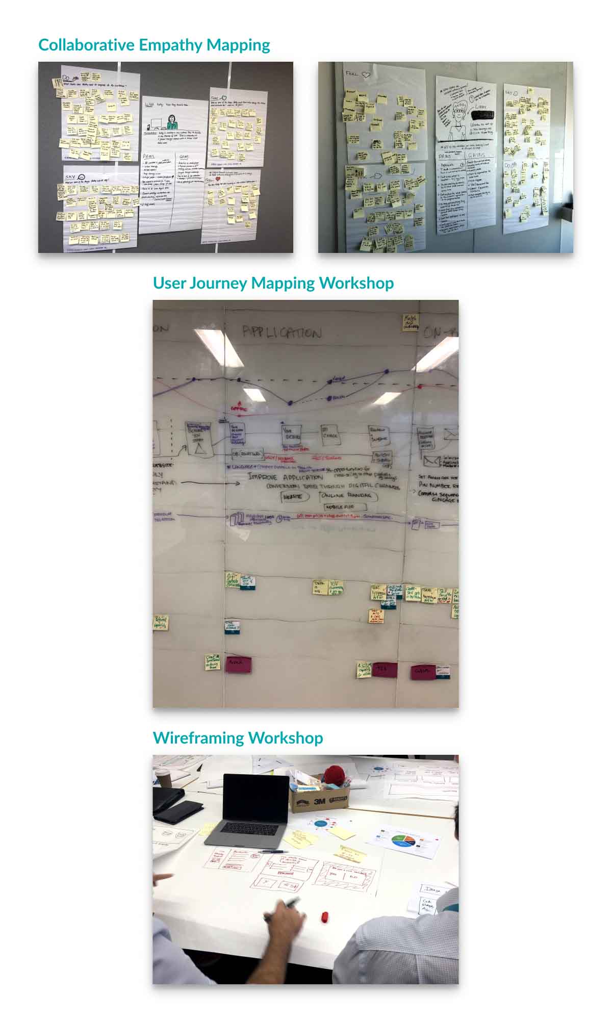
- Empathy mapping with the project team
- Contextual Inquiry within branches
- Interviews of CUA Branch Staff
- Interviews of Back Office Staff
- As is Process Flows of back-office processing.
- User Journey Mapping
Process flow diagrams were produced in collaboration with system analysts to obtain a greater understanding of the current as is process for new member applications. All the data gathered during the discovery phase was consolidated and used to inform a collaborative customer journey mapping session with the project team. This also assisted develop shared goals when identifying areas of improvement to deliver the most business value during the first 90-day cycle.
Scope
The discovery phase highlighted that design and development would need to be split into two phases. To deliver the most business impact, the first phase focused on delivering the ability for new members to open a bank account on the CUA website. Branch staff members could also use this feature on the website to replace the current manual paper form process. The second phase of the project focused on delivering feature sets that were unique for branch account openings.
Design
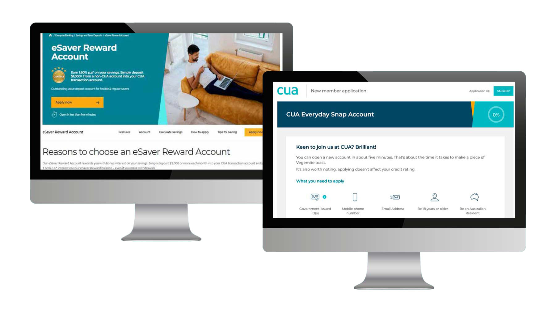
To seek opportunities to improve the content for website pages proceeding the online application, a competitive analysis was conducted. This activity highlighted better placement of call to action buttons and improved content to describe product features.
A heuristic review of the current website pages for CUA revealed 9 key points to improve the overall usability of the page layouts.
Screen flows were produced to document the user journey from website product pages through the existing product inquiry forms.
These artefacts were also used to inform co-design wire-framing workshop with digital team members to brainstorm content and layout improvements based on the outcomes of the competitive analysis, heuristic reviews, empathy mapping and user journey maps.
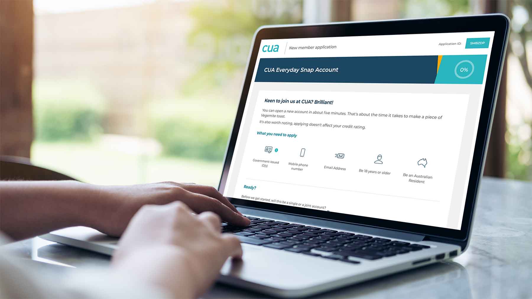
The old enquiry form on the website was replaced with a new digital application form that resulted in a new account being created for the customer within 10 minutes.
This application form also triggered automated processes in the background for card delivery and automated online / mobile banking access. These improvements resulted in a 120% increase in new customer applications.
The automated application form for the website was modified for use within CUA branches by staff. This feature significantly reduced errors and double handling of data entry for branch staff.
The time taken to process a new customer application was reduced from over 60 minutes to 7 minutes to process.

Key Deliverables
- User Interviews
- Competitive Analysis
- Empathy Mapping
- Customer Journey Mapping
- Screen Flows
- As Is and To Be Process Flows
- Wireframes
- Heuristic Reviews
- High Fidelity Designs
- Design Strategy post 90 cycle.
Outcomes
- 120% increase in new business via digital channels.
- 850% decrease in processing time within CUA branches to create new accounts.
- UX strategy for product pages and online applications for CUA post 90 cycle.
- Improved understanding of UX and Agile for CUA team members


