Project Brief
Research shows that fostering student wellbeing enhances learning and social and emotional development.
Resilient, confident students achieve better academic outcomes, make responsible lifestyle choices, and build healthier relationships.
The task was to create an intuitive digital application tailored for primary schools to implement a whole-school approach to supporting students’ mental health and overall wellbeing.
Project Summary
ROLE | Product Owner + UX Designer
PROJECT | Web Platform
DURATION | 6 months
RESPONSIBILITIES | Discovery, requirements gathering, user research, wireframing, screen flows, UI design, testing and validation.
STAKEHOLDERS | Contracted IT Development Team, WellBe CEO & Board
TARGET USERS | Primary School Principals, Teachers and Students.
TOOLKIT | Figma, MIRO, DevOps, Sharepoint, Teams, Photoshop, Illustrator.
Discovery
The Discovery phase for the Wellbe app began with a competitive analysis to explore existing health and wellbeing products and programs in the education sector. Key findings included:
- Most digital products were designed for secondary schools, leaving primary schools underserved.
- Wellbeing frameworks and tools for primary schools often require extensive training for teachers and principals to implement.
- Most digital tools focus solely on measuring students’ emotions or sentiments.
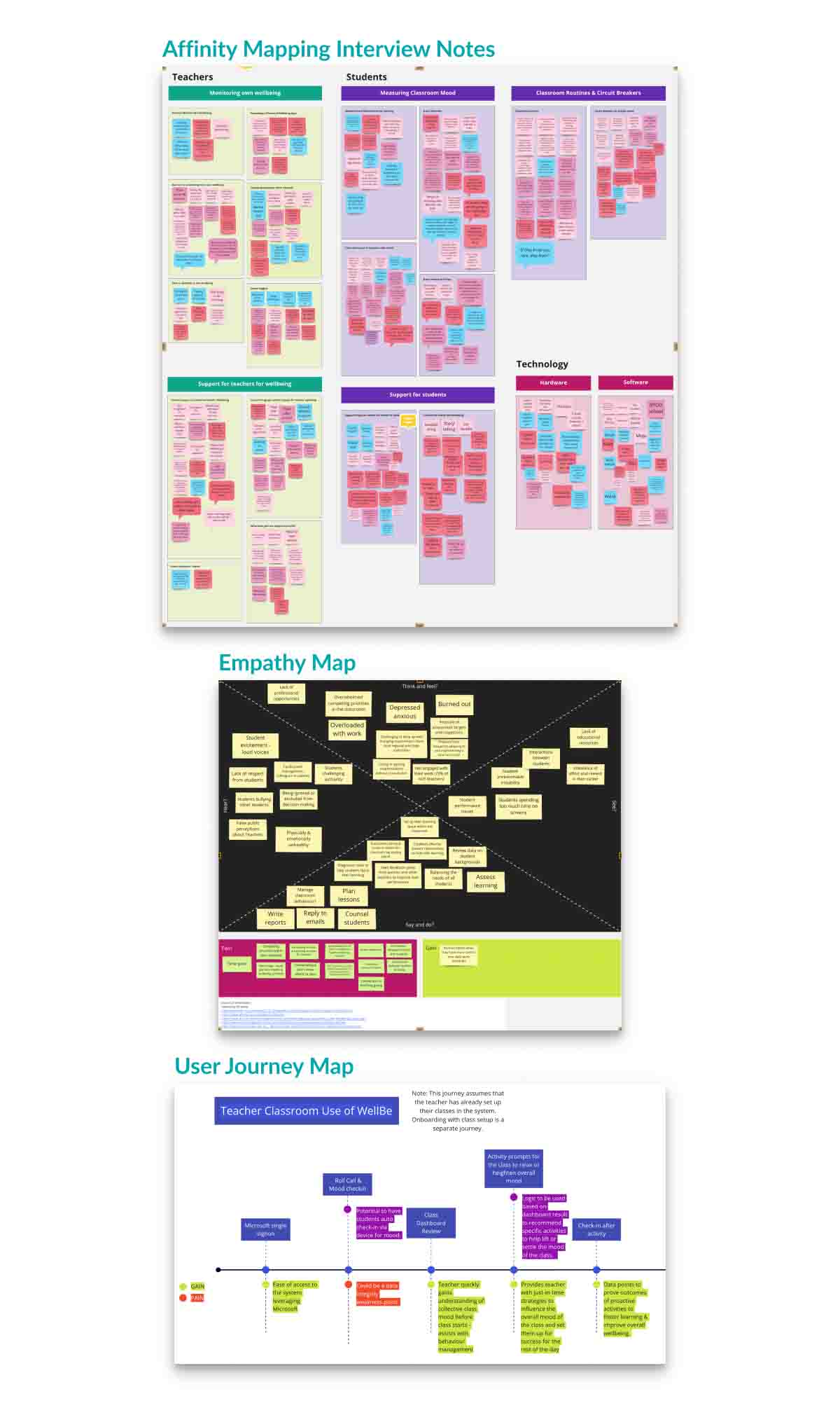
Insights from the competitive analysis informed the design of user interviews with primary school principals and teachers. These discussions covered:
- How educators monitored their wellbeing.
- Current wellbeing support programs for teachers and students.
- Methods for assessing the mood of their classes.
- Classroom routines and strategies for shifting the mood when needed.
- Current use of technology and related challenges for both teachers and students.
Findings from the competitive analysis and user interviews were synthesized into empathy maps and user journey maps, providing a foundation for conceptual design.
Design
The conceptual design of the system focused on providing a mechanism to measure an emotion and then provide an immediate short activity to positively influence that emotion. This mechanism was a differentiator from other digital wellbeing products within the education sector that focused on measuring emotion only and providing weekly or monthly reports on emotional changes.
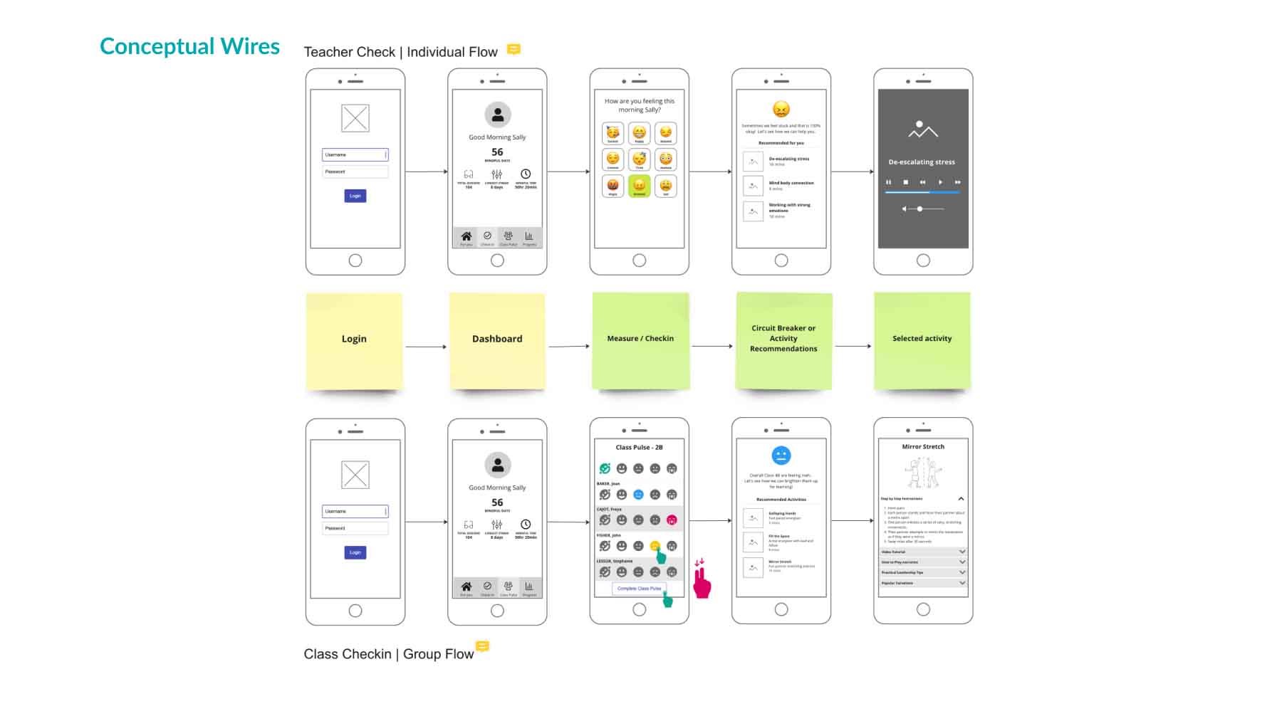
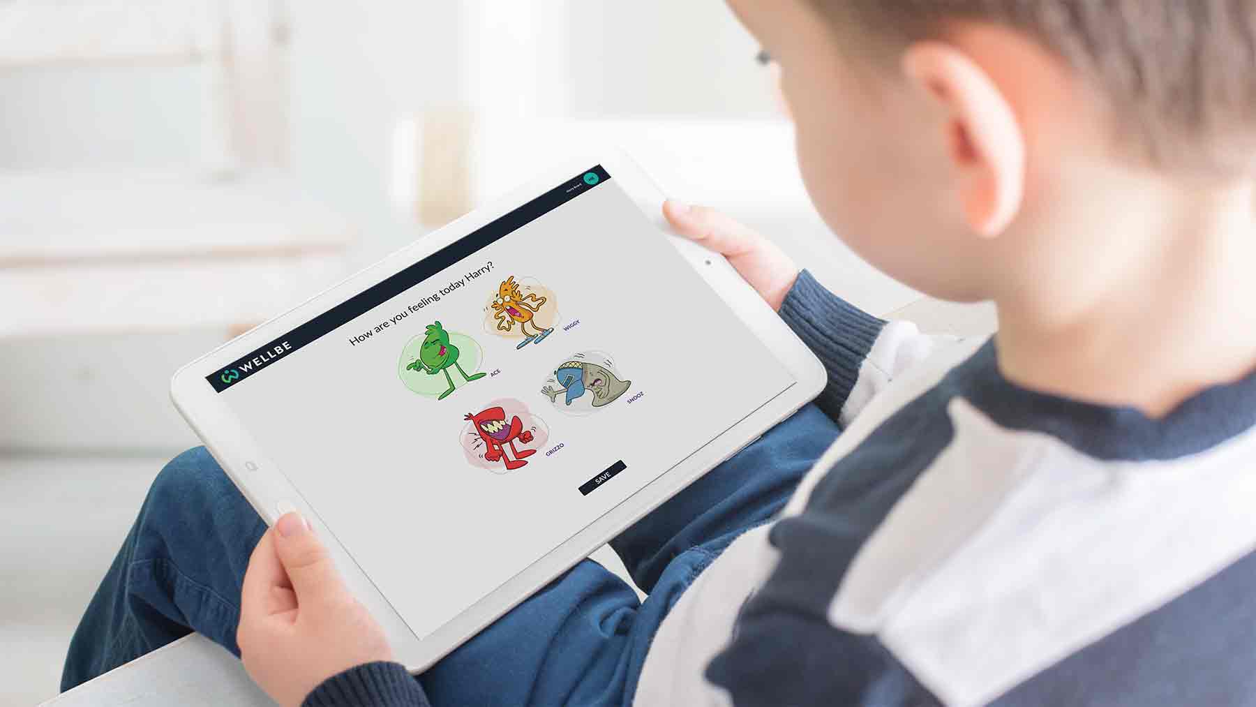
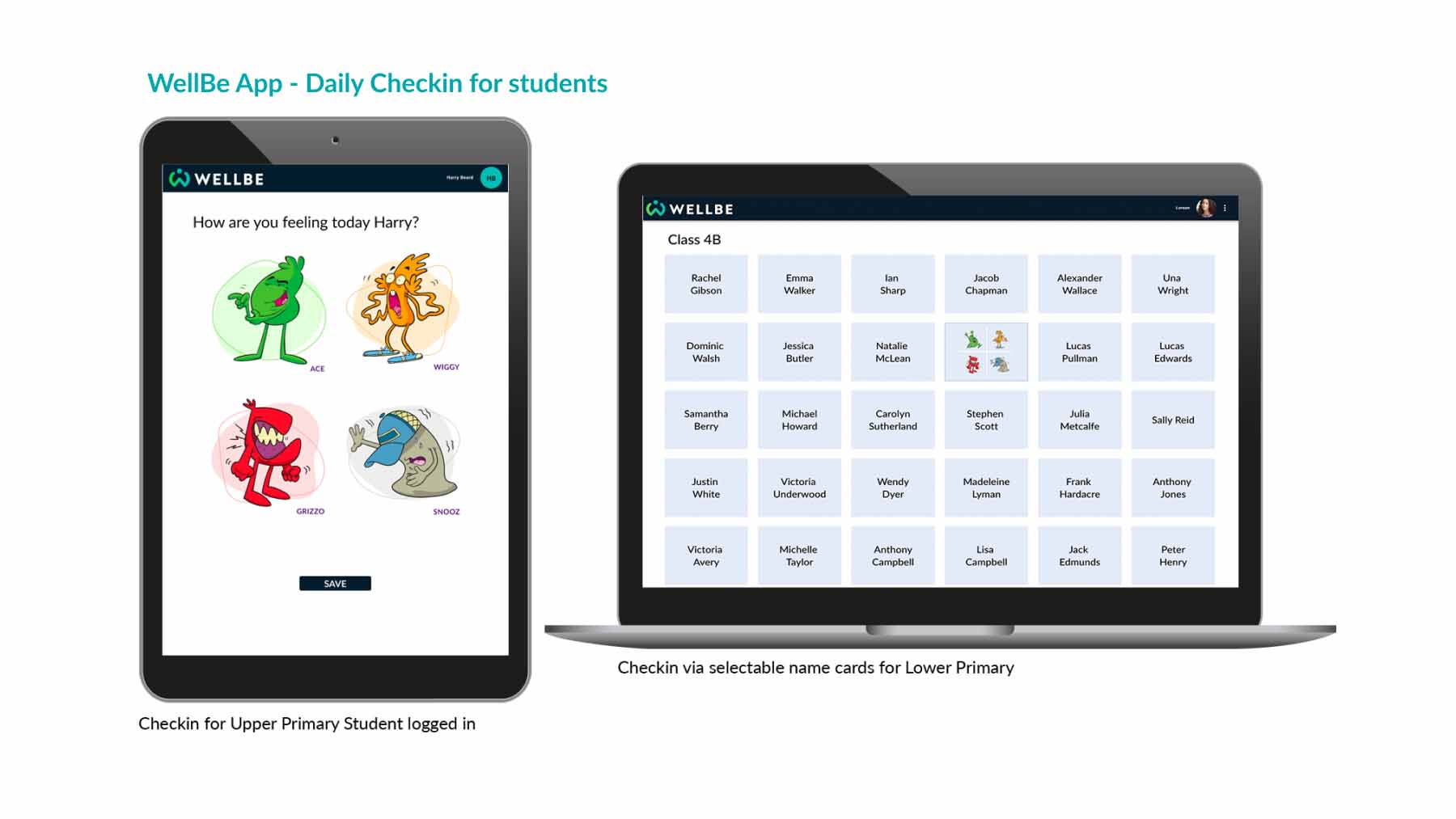
Whilst the conceptual designs for the system depicted a teacher entering the emotions for their students into the system, this was not convenient or achievable within a classroom setting. The students needed to be able to enter their emotion into the system themselves. To make this a fun, rapid and engaging activity for children, the WellBe characters were introduced.
Each WellBe character personified the emotional states and feelings experienced by children. The characters also paved the way to introduce powerful story telling opportunities that further enhanced the ability for children to learn to identify, acknowledge and manage their own emotions.
Upper Primary children with their own laptop or tablet were able to login to the web app via secure SSO technology, interact with the characters and engage with instant activities to support the development of their wellbeing literacy. For lower primary children, they could access the system without a login to interact with the characters and their teacher could facilitate a short activity to positively influence their wellbeing. All children also had the ability to complete a simple Wellbeing Survey providing teachers within insights into their emotional, social, psychological and physiological well-being.
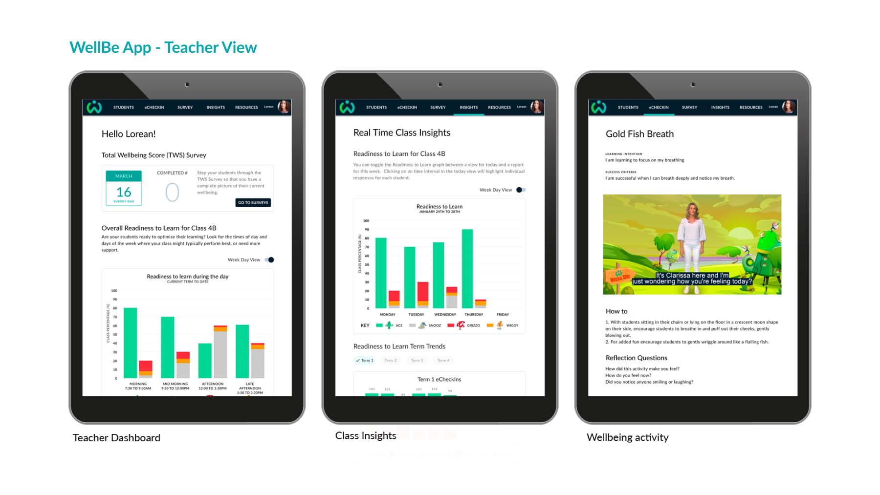
Principals, Wellbeing Officers and Teachers also had the ability to login to the web app via secure SSO technology. All three user groups were provided with access to:
- Real Time Class Insights with a Readiness to Learn metric that was calculated from the characters selected by the children when they interacted with the system. This meaningful data assisted teachers to understand the learning behaviours of their class at any point in time.
- Research informed, wellbeing activities for children to benefit their wellbeing. The design provided teachers with the choice of when and how they could run a wellbeing activity for the class or an individual.
- Whole of school metrics on Readiness to Learn and overall wellbeing.
Key Deliverables
- Competitive Analysis
- User Interviews
- Empathy Mapping
- User Journey Mapping
- Wireframing
- Screen Flows
- Design System within Figma
- User Interface Design
- UAT Testing
- Agile Project Management (DevOps)
Outcomes
- WellBe characters well received by children and teachers.
- Daily engagement from schools with the application.
- Provision of a Readiness to Learn measure that provided meaningful data relating to learning opportunities across a day / week and trends throughout a term.
- Delivery of a whole of school approach to understanding, measuring and positively influencing student wellbeing.

